
Today’s tutorial is a fancy progressive fade-in of images as a webpage loads using jQuery effect fadeTo() and delay() Method. The jQuery that we’ll use is really simple and you might find it useful for other jQuery animation projects. Apart from that, we’ll include some fancy CSS3 image hover effects that you can use on your own projects.
The jQuery code that we’ll use, will work on some old browsers but the CSS3 image hover effects won’t, but will degrade gracefully. The stunning images in our tutorial are by Cedric Mungai. Feel free to contact him to get permission to use his photos.
We’ll start off with the HTML markup below:
HTML
<section id="contentArea" class="centerLayout">
<a href="#" class="image-holder first-set">
<figure>
<div class="image-wrapper">
<img src="images/blue-city.jpg"/>
</div>
<!-- image-wrapper -->
<figcaption>
<div class="paddCont">
<div class="cover">
<div class="text">
<h2 class="image-title">Blue Nairobi</h2>
<p>Lorem ipsum dolor sit amet, consectetur adipiscing elit. Maecenas fringilla felis vel convallis viverra. Integer egestas tellus sed ipsum tincidunt, nec interdum enim euismod.</p>
<span class="read-more">Read More</span>
</div>
<!-- text -->
</div>
<!-- cover -->
</div>
<!-- paddCont -->
</figcaption>
</figure>
</a>
<a href="#" class="image-holder first-set">
<figure>
<div class="image-wrapper">
<img src="images/on-the-edge.jpg"/>
</div>
<!-- image-wrapper -->
<figcaption>
<div class="paddCont">
<div class="cover">
<div class="text">
<h2 class="image-title">On the Edge</h2>
<p>Lorem ipsum dolor sit amet, consectetur adipiscing elit. Maecenas fringilla felis vel convallis viverra. Integer egestas tellus sed ipsum tincidunt, nec interdum enim euismod.</p>
<span class="read-more">Read More</span>
</div>
<!-- text -->
</div>
<!-- cover -->
</div>
<!-- paddCont -->
</figcaption>
</figure>
</a>
<a href="#" class="image-holder second-set">
<figure>
<div class="image-wrapper">
<img src="images/traffic-stream.jpg"/>
</div>
<!-- image-wrapper -->
<figcaption>
<div class="bottomizer">
<div class="text">
<h2 class="image-title">Traffic Stream</h2>
<p>Lorem ipsum dolor sit amet.</p>
<span class="read-more">Read More</span>
</div>
<!-- text -->
</div>
<!-- bottomizer -->
</figcaption>
</figure>
</a>
<a href="#" class="image-holder second-set">
<figure>
<div class="image-wrapper">
<img src="images/night-and-day.jpg"/>
</div>
<!-- image-wrapper -->
<figcaption>
<div class="bottomizer">
<div class="text">
<h2 class="image-title">Night and Day</h2>
<p>Lorem ipsum dolor sit amet.</p>
<span class="read-more">Read More</span>
</div>
<!-- text -->
</div>
<!-- bottomizer -->
</figcaption>
</figure>
</a>
<a href="#" class="image-holder third-set">
<figure>
<div class="image-wrapper">
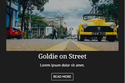
<img src="images/goldie-on-street.jpg"/>
</div>
<!-- image-wrapper -->
<figcaption>
<div class="bottomizer">
<div class="text">
<h2 class="image-title">Goldie on Street</h2>
<p>Lorem ipsum dolor sit amet.</p>
<span class="read-more">Read More</span>
</div>
<!-- text -->
</div>
<!-- bottomizer -->
</figcaption>
</figure>
</a>
<a href="#" class="image-holder third-set">
<figure>
<div class="image-wrapper">
<img src="images/self-selfie.jpg"/>
</div>
<!-- image-wrapper -->
<figcaption>
<div class="bottomizer">
<div class="text">
<h2 class="image-title">Self Selfie</h2>
<p>Lorem ipsum dolor sit amet.</p>
<span class="read-more">Read More</span>
</div>
<!-- text -->
</div>
<!-- bottomizer -->
</figcaption>
</figure>
</a>
</section>
CSS
For the CSS, let’s start off with a general styling for all the images and their containers. Please note the figure container is set to display:none for the jQuery fadeTo() method to take effect beautifully.
.image-holder figure
{
  position:relative;
  float:left;
  width:48%;
  display:none;
  margin:0 1% 20px;
}

.image-wrapper img
{
  width:100%;
  transition:all ease-in-out .4s;
}
First Effect
For our first CSS3 image hover effect, the figure caption will come on top of the image when you hover over the image and the description text and title will animate into place using the CSS3 transform:translate3d(x,y,z).

/************* FIRST SET ************/

.first-set figcaption
{
  position:absolute;
  left:0;
  top:0;
  width:100%;
  height:100%;
}

.paddCont
{
  width:100%;
  height:100%;
  opacity:0;
  padding:20px;
  transition:all ease-in-out .3s;
}

.cover
{
  width:100%;
  height:100%;
  background:rgba(255,255,255,0.76);
  display:table;
}

.text
{
  display:table-cell;
  vertical-align:middle;
  padding:0 10px;
}

.first-set .image-title
{
  color:#003C58;
  margin:0 0 30px;
  transform:translate3d(0,-25px,0);
  transition:all ease-in-out .4s;
}

.first-set .image-title:after
{
  content:"";
  display:block;
  width:70%;
  background:#003C58;
  height:2px;
  margin:20px auto 0;
  transition:all .5s ease-in-out;
}

.first-set .text p
{
  transition:all .6s ease-in-out;
  transform:translate3d(0,-25px,0);
}

.first-set .read-more
{
  display:inline-block;
  color:#003C58;
  border:1px solid #003C58;
  text-transform:uppercase;
  font-size:14px;
  background:transparent;
  margin:10px 0 0;
  padding:5px 7px;
  transition:all ease-in-out .3s;
  transform:translate3d(0,20px,0);
}

.first-set .read-more:hover
{
  background:#003C58;
  color:#fff;
}

.first-set:hover .paddCont
{
  opacity:1;
}

.first-set:hover .image-title
{
  transform:translate3d(0,0,0);
}

.first-set:hover .image-title:after
{
  width:10%;
}

.first-set:hover .text p
{
  transform:translate3d(0,0,0);
}

.first-set:hover .read-more
{
  transform:translate3d(0,0,0);
}
Second Effect
For our second CSS3 image hover effect, the image moves up on top of the image that is above it and the caption moves below on the image that’s below it:

As the figure caption moves on top of the image below, the caption heading and text animates in a catchy way.
/************* SECOND SET ************/
.second-set img
{
  transform:translate3d(0,0,0);
  transition:all ease-in-out .3s;
}

.second-set figcaption
{
  position:absolute;
  left:0;
  bottom:0;
  width:100%;
  height:0;
  overflow:hidden;
  z-index:999;
  background:#D24D57;
  transform:translate3d(0,0,0);
  transition:all ease-in-out .3s;
}

.bottomizer
{
  display:table;
  width:100%;
  height:100%;
}

.second-set .image-title
{
  color:#fff;
  margin:0 0 10px;
  transform:translate3d(0,-70px,0);
  transition:all ease-in-out .5s;
}

.second-set .text p
{
  color:#fff;
  transform:translate3d(0,-70px,0);
  transition:all ease-in-out .4s;
}

.second-set .read-more
{
  display:inline-block;
  color:#FFDDE0;
  border:1px solid #FFABB1;
  text-transform:uppercase;
  font-size:14px;
  background:transparent;
  position:relative;
  margin:10px 0 0;
  padding:5px 7px;
  transition:all ease-in-out .3s;
  transform:translate3d(0,20px,0);
}

.second-set .read-more:after
{
  content:"";
  display:block;
  width:0;
  height:100%;
  position:absolute;
  left:0;
  top:0;
  background:#FFABB1;
  z-index:-1;
  transition:all ease-in-out .3s;
}

.second-set .read-more:hover:after
{
  width:100%;
}

.second-set .read-more:hover
{
  color:#1F1213;
}

.second-set:hover img
{
  transform:translate3d(0,-50px,0);
}

.second-set:hover figcaption
{
  height:130px;
  transform:translate3d(0,40px,0);
}

.second-set:hover .image-title,.second-set:hover .text p,.second-set:hover .read-more
{
  transform:translate3d(0,0,0);
}
Third Effect
For the final image hover effect, the image will scale down and move up a bit to reveal the figure caption below.
/************* THIRD SET ************/

.third-set
{
  overflow:hidden;
}

.third-set .image-wrapper
{
  background:#1d1d1d;
  overflow:hidden;
  padding:0;
  transition:all ease-in-out .4s;
}

.third-set .image-wrapper img
{
  opacity:1;
  transform:translate3d(0,0,0) scale(1);
}

.third-set figcaption
{
  position:absolute;
  left:0;
  bottom:0;
  width:100%;
  height:0;
  overflow:hidden;
  z-index:999;
  background:#1d1d1d;
  transition:all ease-in-out .3s;
}

.third-set .text
{
  transform:translate3d(0,40px,0);
  transition:all ease-in-out .5s;
}

.third-set .image-title
{
  color:#fff;
  margin:0 0 10px;
}

.third-set .text p
{
  color:#fff;
}

.third-set .read-more
{
  display:inline-block;
  color:#fff;
  border:1px solid #fff;
  text-transform:uppercase;
  font-size:14px;
  background:transparent;
  margin:10px 0 0;
  padding:5px 7px;
  transition:all ease-in-out .3s;
}

.third-set .read-more:hover
{
  background:#fff;
  color:#1d1d1d;
}

.third-set:hover .image-wrapper img
{
  opacity:0.7;
  transform:translate3d(0,-40px,0) scale(0.9);
}

.third-set:hover figcaption
{
  height:130px;
}

.third-set:hover .text
{
  transform:translate3d(0,0,0);
}
That’s it for CSS! To get the browser prefixes for some of the css properties, view the css page source for the demo or download the source files.
Javascript
The final bit for the tutorial is pretty simple. We are going to run our jquery code in a window.load(function(){}) to make sure that everything has loaded so that we can see the progressive fade-in effect perfectly.
$(window).load(function(){
	$('.image-holder figure').each(function(i) {
		$(this).delay((i++) * 850).fadeTo(1300, 1);
	});
})
Basically, each image container, .image-holder figure, is looped over using each() method. The method captures the index of each .image-holder figure. The images fade-in to an opacity of 1 within a speed of 1300ms through an incremental delay of 850ms.
The incremental number is the index of each .image-holder figure which is then multiplied by 850ms to give the actual delay time for each image container to come to an opacity of 1.
Hope you enjoyed the tutorial of creating a progressive fade-in of images using delay() and fadeTo() Javascript methods and the subtle CSS3 image hover effects. You are free to apply them in any of your projects. Don’t forget to comment and share!