Albeit the fact that flat design has been quite popular in 2014, there have been great websites that have emerged with a taste of skeuomorphism.
If you haven’t been around on the web of late, here are the descriptions of the two UI designs: Flat design refers to a simplistic approach to user interfaces where usability is the main focus. It constitutes of clean, two-dimensional elements without depth and heavily depends on color and typography. On the contrary, skeuomorphism simulate real-world objects on user interfaces.
The battle between flat design and skeuomorphism hasn’t effected , but there have been designers who have tried to create a truce between the two styles by combining the best of the two worlds into one user interface design. The following list showcases some of best examples of skeuomorphic web designs. Some web user interface designers have implemented the two concepts and others, well, are just pure, die hard skeuomorphic UI designers. Have a look.
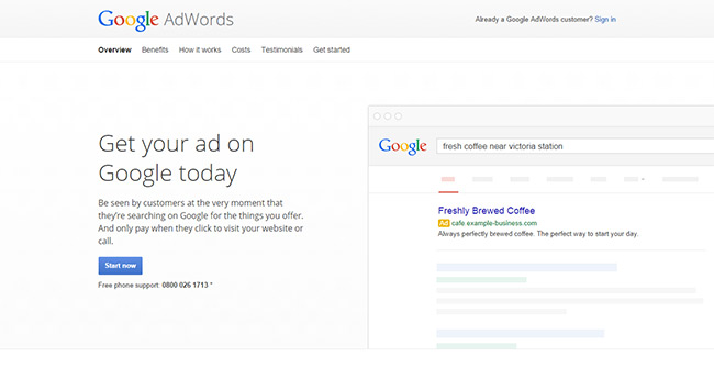
Google Adwords
Google Adwords has a remarkable combination of flat design and skeuomorphism. As the page is on the initial load, the search bar image on the right creates an impression that one is typing on a google search bar looking for information. Google Adwords’ website is also clean and minimalistic.
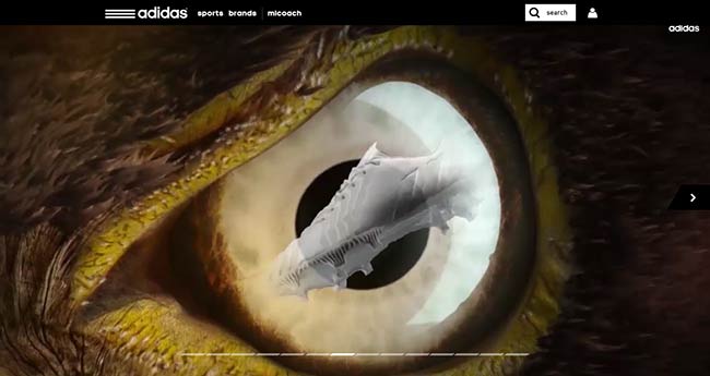
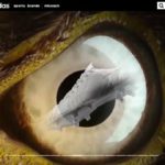
adidas Predator
adidas Predator is a stunning website with a skeuomorphic concept on the landing page banner. The different adidas Predator products are showcased as a reflection on the predators’ eyes. It’s a unique concept with bits of flat elements. You need to put your earphones on to revel in this site.
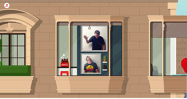
The Building of Memories
The Building of Memories website from Coca-Cola reveals the power of skeuomorphism. The concept is staged on a building where you need to use your mouse cursor to go up the building. The website has sound on the background too.
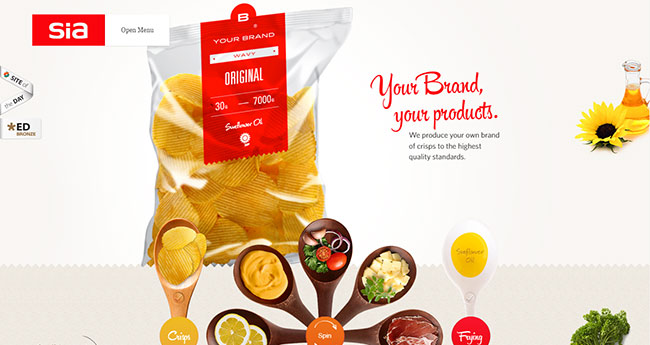
Sia
Sia has a very intriguing website where you create your own flavored crisps by the help of culinary utensils. It’s quite an interactive website.
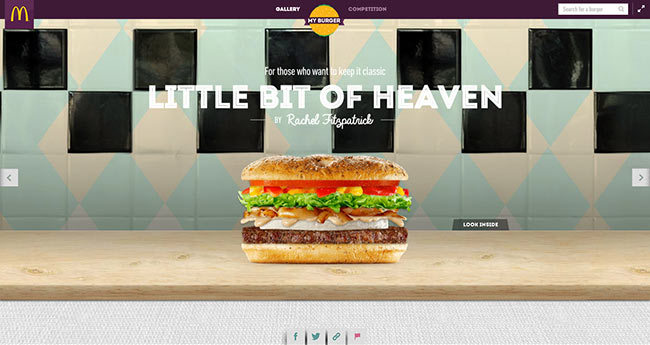
Mcdonald’s – My Burger
This is another skeuomorphic-styled website showing different variants of Mcdonalds’ burgers on a kitchen counter. The burger images are as real as eating a real life meat-stuffed burger.
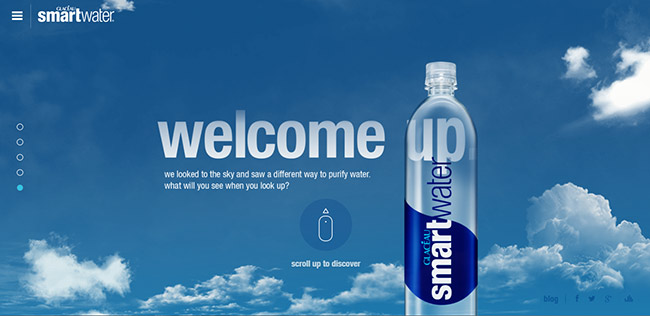
Smart Water
A brilliant website that distinctively reveals the water formation process, making one feel hedged in with the clouds. Realism is added to this site with the sound of rushing wind.
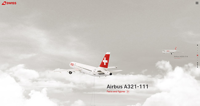
World of Swiss
Here’s another awesome website that makes you float in the sky. Not only is it visually impressive but also the content has been spruced up in a way that’s intuitive.
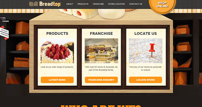
Breadtop
As one lands on the page you can’t help but notice how links to other pages of the site have been placed in frame-like picture holder. The site also works well for a one page website.
New York Summer
One of the sections on this site has content placed on a stack of paper layout. It’s a simple website with all information neatly placed.
PS4 Gamer Master Piece
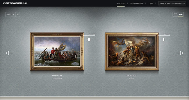
This absolutely loveable website showcases submitted paintings on golden frames hanged on a textured wall. The website creates an impression of an art collection center.
Donguri Music
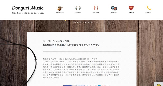
Donguri Music website takes an illustrative approach with a clean, white-spaced concept. The about section creates an illusion of a paper placed on a wooden table with headphones beside the paper. Besides the illustrations, the headphones compels one to assume it’s a music website.
AlsterCloud
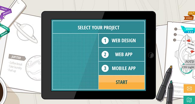
AlsterCloud flaunt their web creativity by the use of beautiful illustration and realism. One can choose the type of service you want from them by simply clicking on their tablet screen.
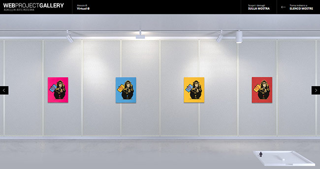
Web Project Gallery
This is another stunning website that showcases the art of skeuomorphism through pieces of art paintings hanged on walls. The choice of typography adds a degree of visual impressiveness.
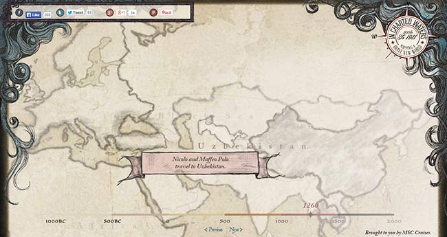
In Chartered Waters
The early exploration of the world couldn’t be conveyed more beautifully on an ancient map-like concept. The typography used matches up with the ancient look.
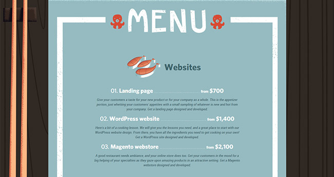
Shokunin
Shokunin have a very fascinating concept of presenting their web services charges. The varying prices have been captured on an intuitive, restaurant-menu-like layout.
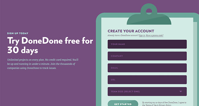
DoneDone
DoneDone’s website has a brilliant skeuomorphic interface for the Sign Up section. The form seems to be placed on a paper that has been placed on a greenish clipboard. The website itself is clutter free and has bits of flat design.
Any good skeuomorphism on the web you have seen around? Please share on the comments below.


